Feedback on this UTAU design?

spookysneeze

Ruko's Ruffians
Defender of Defoko
So, since I'm making a start on my UTAU, Yachi Kusatsu, as soon as I get my microphone (which should be in a few days) I've been going over her design a lot, trying to get it the best I can. So I'd like some feedback on it!

yachi_kusatsu___final_design_by_itsmeitsprussia-d8tpk2r.png

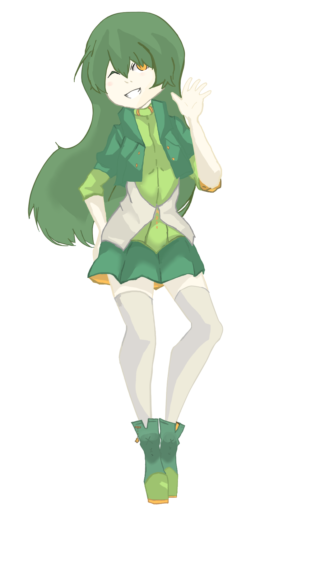
I'm trying to make her look like a young, cheerful kind of person, and I wanted her main colour to be green. I went through about ten colour schemes before I settled on this, lol.

Here's the older version:
yachi__full_body_ver___by_itsmeitsprussia-d8h3d1t.png


EDIT: Oh, and this is only slightly related, but I'm planning on making two other Utsus, and them combined with my friends UTAUs were going to form a kind of..UTAU idol unit.
 

Pupperoni Pizza

Ruko's Ruffians
Defender of Defoko
She looks very leafy/nature inspired.

Her current design is much more balanced than her old one and very present to look at.
The hints of orange contrast very nicely with the green.

From the looks of it, you have hit your design intentions spot on.

The only strangeness is that her eye color is very..."eye catching" (for lack of a better term), which is good if you want people to be drawn to her face.
Other than that it looks very well done.
 

spookysneeze

Ruko's Ruffians
Defender of Defoko
Thread starter
She looks very leafy/nature inspired.

Her current design is much more balanced than her old one and very present to look at.
The hints of orange contrast very nicely with the green.

From the looks of it, you have hit your design intentions spot on.

The only strangeness is that her eye color is very..."eye catching" (for lack of a better term), which is good if you want people to be drawn to her face.
Other than that it looks very well done.

Thanks for the feedback!
I wasn't sure about the eyes, because I wasn't sure if it was better to make them orange, so I might end up changing them to orange and seeing how it looks.
 

WyndReed

Dareka tasukete!
Global Mod
Defender of Defoko
Ooh, she's pretty cute!
For starters, the colors work nicely together and the design is very elegant. The flower on her vest and the mark on her left wrist look kinda out of place to me.
I also agree with what DogToast said about her eye color being "eye catching".

Overall though, it seems like a pretty good design.
 
F

Fuutari Makku

Guest
it's horrible.
.
.
.
.
.
.
.
jk , it's really cute , i like your style ^_^
 

spookysneeze

Ruko's Ruffians
Defender of Defoko
Thread starter
Ooh, she's pretty cute!
For starters, the colors work nicely together and the design is very elegant. The flower on her vest and the mark on her left wrist look kinda out of place to me.
I also agree with what DogToast said about her eye color being "eye catching".

Overall though, it seems like a pretty good design.
Thanks! I did try changing the eye colour to orange, and I think it does look a bit better.

it's horrible.
.
.
.
.
.
.
.
jk , it's really cute , i like your style ^_^
Thankyouu ;u;
 

Skiyoshi 十三

Lotus#12915
Defender of Defoko
Wow, I can definately see the improvement from your original design. I love the little lucky clover charm on her shoes, hehe.

Maybe take the green leaves out of the flower on her vest? It's only my opinion but it looks like the vest would be better without the leaves. If I may ask, what is the mark on her wrist? Her "product number"?
 

spookysneeze

Ruko's Ruffians
Defender of Defoko
Thread starter
Thanks!
The mark on her wrist is a music note, although it's hard to see.

Here's the one with the flower taken away, and orange eyes:
ZCo1uJM.png

and heres one with the flower without leaves
ZayJlxr.png