New Design Critique

TheEternalChild7

Ruko's Ruffians
Defender of Defoko
Hello, all. I've got one more design for you to look at, if you don't mind. (This is the last one, at least for a while, I promise!)
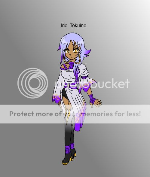
Do you think this color scheme/design works? If not, do you have any advice for me? I'm kind of iffy on a couple of things, but I'm not sure if I'm just being a perfectionist or not...

UTAUNewDesign1_zps82ccff4b.jpg
 

FelineWasteland

Feral Catboy
Defender of Defoko
The colour scheme overall is nice, but I'd suggest using a cooler shade of white for the dress and the top of the stockings. The periwinkle in the hair looks a bit off with the violet tips, but that's just a personal opinion and not something that really deteriorates from the design.

The dress itself is very busy, and distracts away from her face. If you want the dress to be the focus, leave it be, otherwise perhaps simplify it a little, particularly the purple bands.

Overall a unique design; I'd probably listen to her.
 

TheEternalChild7

Ruko's Ruffians
Defender of Defoko
Thread starter
Thank you! :3 I'll try out your suggestions and see how it looks. (Probably much better, since some of the things you pointed out are the ones I was already iffy about.) Thanks again for your help!
Anyone else have any advice?
 

Dara

Momo's Minion
She is super cute!!~ My suggestions is that there is a lot going on. Her silhouette would be wonderful if the right arm sleeve was the same as the left, or vise-versa. The gradients look nice, but the yellow marks just kind of throw it off. I dont really understand the leggings, but they look cool, like a fantasy type feel. Maybe even the white change it to her hair color to tie the outfit together? I hope that helped.