I tested the like function. I think others can see it? (A box should be on the bottom of otetos post).
-
 If you do not recieve your confirmation email within a few hours, please email haloutau@gmail.com with your username for manual validation. Your account should be activated within 24 hours.
You may also reach out via any other listed contact on Admin Halo's about page: https://utaforum.net/members/halo.194/#about
You are using an out of date browser. It may not display this or other websites correctly.
You should upgrade or use an alternative browser.
You should upgrade or use an alternative browser.
XenForo Transition Thread
- Thread starter Hentai
- Start date

I can't even see the links because of driver issues streaking red and blue :PThis is quite a lovely looking skin! It's very clean, smooth and stylish! My only qualm is that the purple text on the black color is a bit of a strain on the eye, so maybe a lighter purple could be used for links? Other than that, this is very wonderful!
Though, I agree, the purple is a TINY bit dark, ...though I don't have as much of a problem now that I calibrated my monitor...
We agree, and we're on it.This is quite a lovely looking skin! It's very clean, smooth and stylish! My only qualm is that the purple text on the black color is a bit of a strain on the eye, so maybe a lighter purple could be used for links? Other than that, this is very wonderful!


More minor template tweaks to the dropshadows and link pallet. I desaturated link colors, made them a bit lighter, and tweaked a some other text highlights as well.
If you continue having issues with the current theme I suggest you try calibrating your display as the colors look much better on mine and while I had slight issues earlier, things look pertty good on my end ATM.
Down the road plan on making a 'light' variant of the existing theme for those that prefer lighter backgrounds but that is a bit of a ways off. First I would like to iron out existing bugs while I can and work on an alternate default theme down the road.
Nothing beyond acting as a bit of e-peen™. It encourages people to explore all the various functions of the forum and awards people for positive activities. All it does is rank you higher in the "notable members" tab, but beyond that it has no real function.
If you continue having issues with the current theme I suggest you try calibrating your display as the colors look much better on mine and while I had slight issues earlier, things look pertty good on my end ATM.
Down the road plan on making a 'light' variant of the existing theme for those that prefer lighter backgrounds but that is a bit of a ways off. First I would like to iron out existing bugs while I can and work on an alternate default theme down the road.
Sooo..I see the trophies come with points.....what do the points do?
Nothing beyond acting as a bit of e-peen™. It encourages people to explore all the various functions of the forum and awards people for positive activities. All it does is rank you higher in the "notable members" tab, but beyond that it has no real function.
More minor template tweaks to the dropshadows and link pallet. I desaturated link colors, made them a bit lighter, and tweaked a some other text highlights as well.
If you continue having issues with the current theme I suggest you try calibrating your display as the colors look much better on mine and while I had slight issues earlier, things look pertty good on my end ATM.
Down the road plan on making a 'light' variant of the existing theme for those that prefer lighter backgrounds but that is a bit of a ways off. First I would like to iron out existing bugs while I can and work on an alternate default theme down the road.
Ah yes, things look better now! While the monitor I use makes the links look darker the farther away I am, I don't have to squint anymore to read the links
 Thanks so much Hentai.
Ahh~ Looking around in this beta, I like everything so far!
But I think it's just me but you can't seem to see one's other accounts? (Tumblr, Youtube, etc.) I keep looking around but can't seem to find where they're located. (not the fields where you put them but where you can view others' and yours)
I also miss the "View New Posts | View Today's Posts" features. I used them very often in the previous UTAforum.
Last edited:
Didn't see this thread existed! Nice to see how it's been developing.
One small thing I've noticed is that this forum doesn't shorten links? Like on the previous forum if your link you posted was long it would abbreviate it/shorten it to make the section more readable, but now links seem to be whole and can be jarring if they're long. Is there a way to implement that again or should I just get used to making them text links?
Also the instant I saw Kimchi's post in a sans-serif font it was much more legible. I have very poor eyesight and even though my computer monitor is huge this site is a strain for me at the moment. (And the fonts seem very small in comparisson to the old forum or is that the colors playing tricks on me?) Really looking forward to a lighter version of the sight, hope that helps.
It feels selfish bringing it up as I seem to be the only one with problems at the moment, but I love visiting Utaforum every day and currently the site makes me squint and look close too much for my comfort. ;;
Last edited:
There's no chat because we're waiting for the money from the Kickstarter to clear. We fronted the cost for the forum software, but we can't get licenses for our upgraded plugins (like our better chat) until the funds come through.
Thanks for your patience, it'll be worth it!
Thanks for your patience, it'll be worth it!
Didn't see this thread existed! Nice to see how it's been developing.
One small thing I've noticed is that this forum doesn't shorten links? Like on the previous forum if your link you posted was long it would abbreviate it/shorten it to make the section more readable, but now links seem to be whole and can be jarring if they're long. Is there a way to implement that again or should I just get used to making them text links?
Also the instant I saw Kimchi's post in a sans-serif font it was much more legible. I have very poor eyesight and even though my computer monitor is huge this site is a strain for me at the moment. (And the fonts seem very small in comparisson to the old forum or is that the colors playing tricks on me?) Really looking forward to a lighter version of the sight, hope that helps.
It feels selfish bringing it up as I seem to be the only one with problems at the moment, but I love visiting Utaforum every day and currently the site makes me squint and look close too much for my comfort. ;;
I agree actually.
I feel this theme is pretty but after looking at it for a while my eyes start to hurt.
I will probably use the light version when it's up ;u;
I'm not sure wether or not this is nessesary to say or not, but some of the icons and titles to the treads on the forum section are lighter than the others. (thou it might just be work in prosess regarding the colours)
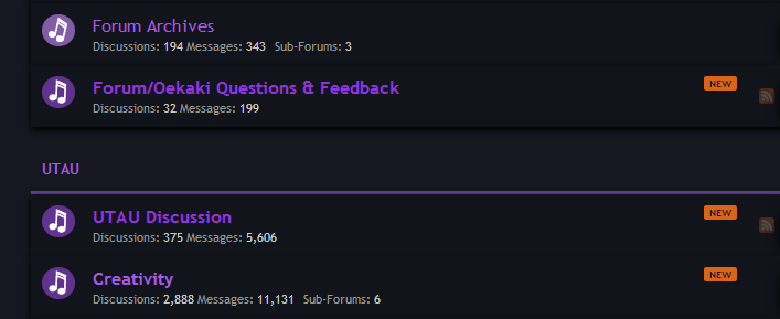
both the icon and title for Forum Archives are ligher than the rest (it's easyer to see on the title of creativety).
both the icon and title for Forum Archives are ligher than the rest (it's easyer to see on the title of creativety).
Hulder, the reason is that the lighter music circle means there's no new posts while the darker ones mean there are - notice the orange "New"s on the side. I currently use the orange ones because the purple difference is very minimal.
Ah, I see. Silly meHulder, the reason is that the lighter music circle means there's no new posts while the darker ones mean there are - notice the orange "New"s on the side. I currently use the orange ones because the purple difference is very minimal.
Recent Changes
Aha, the data from the old boards ported but has yet to be implemented on the profiles. Will need to look into adding them to the display order.
As for viewing recent activity we do have a View New Posts and it even has a nifty feature which tells you which posters are new enough that you haven't seen them yet. Likewise under the Members tab there is a View Recent Activity which will show you not only forum posts but status updates and profile changes.
- New BB Code & Media Embeds
View all BB Code here. New Media embeds include Soundcloud, NicoVideo, and much, much, more! There are 50+ supported sites now. - Implemented Forum Badge System
Added various medals related to the Kickstarter that made this possible. View examples in my postbit with current listing of all available here. - Implemented Voting Token Bank
In preparation for the upcoming Skin Voting System I have begun testing of an integrated virtual currency system. - Added User Group Flags
Added user group flags to the postbit so you can easily see both the staff. Along with staff position flags we also have a new "Supporter" flag to mark everyone who has helped contribute to making UtaForum 4.0 possible.
But I think it's just me but you can't seem to see one's other accounts? (Tumblr, Youtube, etc.) I keep looking around but can't seem to find where they're located. (not the fields where you put them but where you can view others' and yours)
I also miss the "View New Posts | View Today's Posts" features. I used them very often in the previous UTAforum.
Aha, the data from the old boards ported but has yet to be implemented on the profiles. Will need to look into adding them to the display order.
As for viewing recent activity we do have a View New Posts and it even has a nifty feature which tells you which posters are new enough that you haven't seen them yet. Likewise under the Members tab there is a View Recent Activity which will show you not only forum posts but status updates and profile changes.
Last edited:
It took me a veeeery long time to notice this next thing. So on the old forum when you go into a subforum you can telll exactly which threads have new content because they were bolded and very easy to tell apart from the other threads. For a whole week now I've thought the new forum didn't have that until I looked closer and they are indeed bold but it's just so so so hard to tell. For at least the dark theme I think it should be changed to a different color and it'll need to be checked in a light theme to see if it works. It's a nitpick but it's something that's bothered me until I was struck with an "ah hah!" moment.